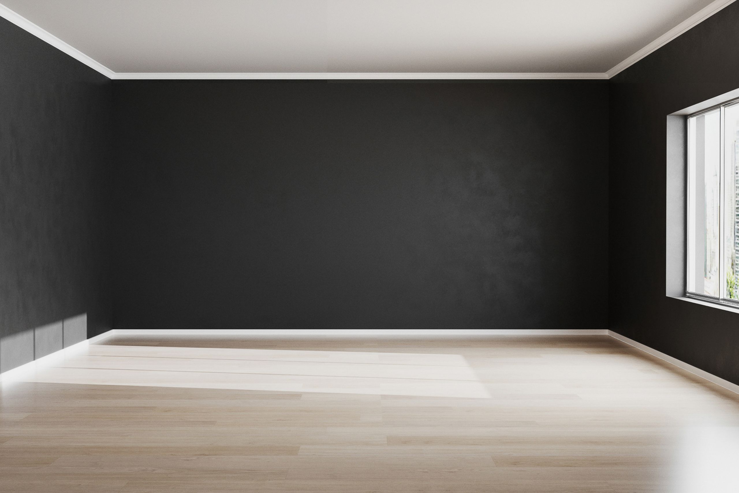
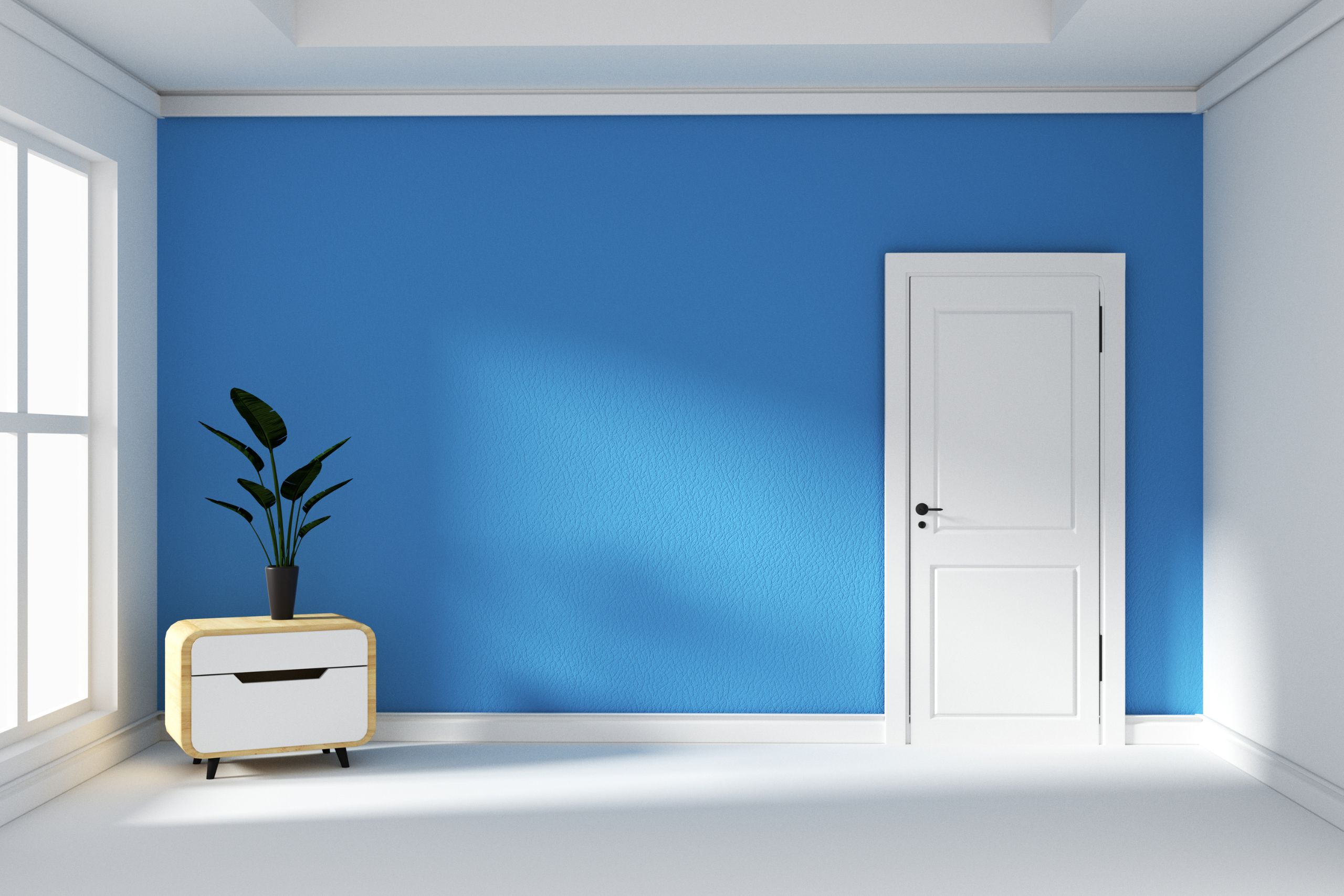
Celebrated for their elegance and cohesion, monochromatic color schemes have become somewhat trendy in modern architecture. Variants of a single hue help designers create simple and beautiful surroundings. This approach ensures a constant visual by means of which every element of a scene improves another, therefore creating a harmonious environment. Monochromatic schemes’ adaptability to several styles—from simple and modern to classic and opulent—allows one to match them.
The emphasis of this essay will be on methods for obtaining an effective monochromatic appearance by use of many tones, tints, and textures to provide depth and interest. The essay will also go over the benefits of a monochromatic palette in terms of tranquility and an organized visual flow. Analyzing these aspects will assist readers to better grasp how to use monochromatic design in their own surroundings, therefore enhancing the interior aesthetics and maintaining simplicity.
The Basics of Monochromatic Color Schemes
Monochromatic design emphasizes the use of one color, altering its tones, shadows, and tints to provide depth and intrigue. Using the same color family lets one create a harmonic and coherent visual experience where the differences in brightness and saturation accentuate the whole aesthetic without using conflicting colors.
The great and timeless quality of monochromatic appeals to me. From contemporary minimalism to more classic styles, it presents a classy ambiance that is readily changed to fit any environment. Monochromatic furniture provide harmony and peace; often, monochromatic environments appear bigger and more calm. From interior design to fashion, this timeless design idea is still much sought after in many diverse applications.
The foundation color used determines significantly the desired ambiance of a space or design endeavor. Calm blues might provide tranquility; warm neutrals inspire warmth and comfort. Think on the desired emotional reaction and the surroundings where the design will be implemented to choose a suitable foundation color. A great monochromatic palette may be built upon a carefully selected base hue.
Layering Tones, Shades, and Tints for Depth
Any area will benefit from layered tones, shadows, and tints giving visual intrigue and depth. Tones are variations of a hue produced by adding gray, therefore rendering the color either subdued or muted. Adding black produces shadows that are deeper and might arouse feelings of warmth and richness. Adding white produces lighter variations of a hue that provide a fresh, breezy impression, hence creating tones.
Different variants of the same hue allow designers to create a harmonic yet dynamic environment. For contrast without overstretching the space, for example, mixing a rich navy sofa with softer blue accessories and lighter blue walls The blue grounds; the lighter tones maintain brightness and openness.
Another excellent approach is to use a medium-toned gray for furniture against soft white walls and enhanced by velvety gray and white materials. This stacking creates a nice and cozy environment. By using these color variations, one assures the space remains harmonious and friendly while allowing depth and mystery and enhances the total appeal.
Enhancing Monochrome with Texture and Patterns
The value of texture in a monochrome setting is virtually difficult to overestimate. From matte, glossy, soft, or rough, an otherwise homogeneous room might have considerable depth and appeal from several textures. For instance, a matte wall combined with glossy accent points produces a striking contrast that accentuates the whole visual attractiveness. Likewise, adding soft cushions next to hardwood furniture creates a tactile sensation that enhances the welcoming qualities of the area.
Including minute patterns improves the design even further. Stripes or herringbone in the same color family may interrupt the monotony without overloading the senses. These little changes are very important for creating visual interest and enabling the space to remain coherently beautiful while still feeling dynamic.
Another great tactic is mixing components. Combining many fabrics—such as velvets and linens—along with metals and natural materials like stone or wood keeps a flat look free. This interaction of elements generates layers and dimensions, therefore producing a complicated and rich environment. A monochrome area may become a harmonic refuge full of charm and warmth by carefully combining textures, patterns, and materials.
Lighting as a Key Element in Monochromatic Spaces
Natural light greatly changes the way monochromatic areas see color all day long. One color might seem very different when sunlight moves from the soft, warm light of morning to the brilliant, neutral tones of noon and eventually to the golden colors of sunset. A light blue wall at dawn, for example, can seem tranquil and peaceful, yet by midday the same wall might seem vivid and energetic. This dynamic change makes a place seem alive and welcoming, improving its whole ambiance.
Layered lighting is very necessary to optimize color in a monochrome design. Combining accent, job, and ambient lighting allows you greater unfettered expression of different tones. Usually stressing on work areas, task lighting improves; ambient lighting produces a soft glow; and accent lighting accentuates certain colors or decorational aspects.
Furthermore, the color temperature of light bulbs determines much how colors are seen. Cold lighting would highlight the colder tones while warm light bulbs would improve the warm undertones of a hue. By carefully selecting lighting types and temperatures, one may create a harmonic and visually beautiful monochromatic environment that seems both balanced and vibrant.

Conclusion
Monochromatic color schemes perfectly complement elegance and adaptability, therefore improving the visual attractiveness of any environment. Designers may create a harmonic setting that communicates refinement and cohesiveness by using several tones and tints of one color. The way textures interact and the deliberate use of lighting improve this design approach even more so enabling one to create a dynamic but cohesive appearance. By means of decorations, furniture, or wall colors, this experimenting with various hues promotes a personal touch, therefore transforming every place into a unique mirror of one’s taste. Monochromatic beauty is found in its versatility; depending on the tones used, it may vary from peaceful and soothing to strong and vivid. Readers are urged to welcome the difficulty of honing their monochrome palette and seeing the transforming potential it might provide for their businesses or house. Investigating specialized “color inspiration and trends” websites may provide individuals looking for additional inspiration insightful analysis and creative suggestions to enhance their design projects.

